|
Unit 1 : Lesson
1: This apartment is too small!
Document literacy: Reading a graph
Who owns their home in the United States?
A graph is a way of displaying information
using a kind of picture or illustration. A graph allows
the reader to understand a good deal of information quickly,
to make comparisons, and to come to conclusions about information.
There are many kinds of graphs. One type
is a circle graph. A circle graph uses parts of a circle
cut into segments (like a pie) to show parts of a whole
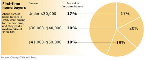
(or 100 percent). Below is an example of a circle graph.
Information about home buyers at three different income
levels is placed in a column titled “percent of first-time
buyers.” Information about the percentage of buyers
at each income level is placed in a column titled “income.”
Look at the circle graph below. It shows
how many households with an income of $50,000 a year or
less bought a home in the U.S. for the first time. A household
may include one person with one income or several persons
who put their incomes together to help pay for a house.
One shaded segment of the circle graph
indicates that 17 percent (17 out of every 100) of those
who bought a house for the first time had an income of under
$30,000 a year. Another shaded section shows that an additional
20 percent of those buying a home had an income of between
$30,000 and $40,000. The graph also shows that 19 percent
of households making $41,000 to $50,000 were first-time
home buyers. All together 56 percent of those buying a home
for the first time make $50,000 or less a year.

Previous
Page | Next Page
|